cyber.harvard.edu – web presence redesign
Berkman Klein Center for Internet & Society at Harvard University
Drupal, Sketch, Adobe Illustrator, GitHub
Role: In-House Project Lead, Strategist
Inception: December 2017 • Launch: August 2018
cyber.harvard.edu is a website for researchers, journalists, and tech leaders to connect to the research, events, people, and opportunities of the Berkman Klein Center for Internet & Society at Harvard University, focused on technology in the public interest
The Problem
The Berkman Klein Center is a world class technology research institute, and pioneered the study of the internet starting way back in the 1990s when the world wide web was still young.
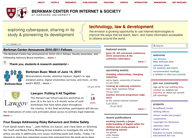
Our website had not seen a significant update to its navigation, design, or backend since 2007. In that time, mobile and responsive devices had become the priority, and simplicity and clear navigation had become vital, as we now competed with a growing number of institutions in our topic space.
As the Center’s Digital Media Producer since 2008, I became the In-House Project Lead for the job of overhauling the Center’s website in 2017.
I coordinated all phases of redesign on behalf of the Center, from vendor selection, to ideation and research, to information architecture, to technical implementation. I facilitated feedback from a broad group of internal stakeholders, mocked up, scoped, and assigned hundreds of technical and design requests to a team of developers through GitHub, architected and implemented the site’s content strategy, and coordinated our relaunch in summer of 2018.
After being promoted to Communications Manager I also ran the site day-to-day, and developed all content in the first year of its relaunch.
Research & Ideation
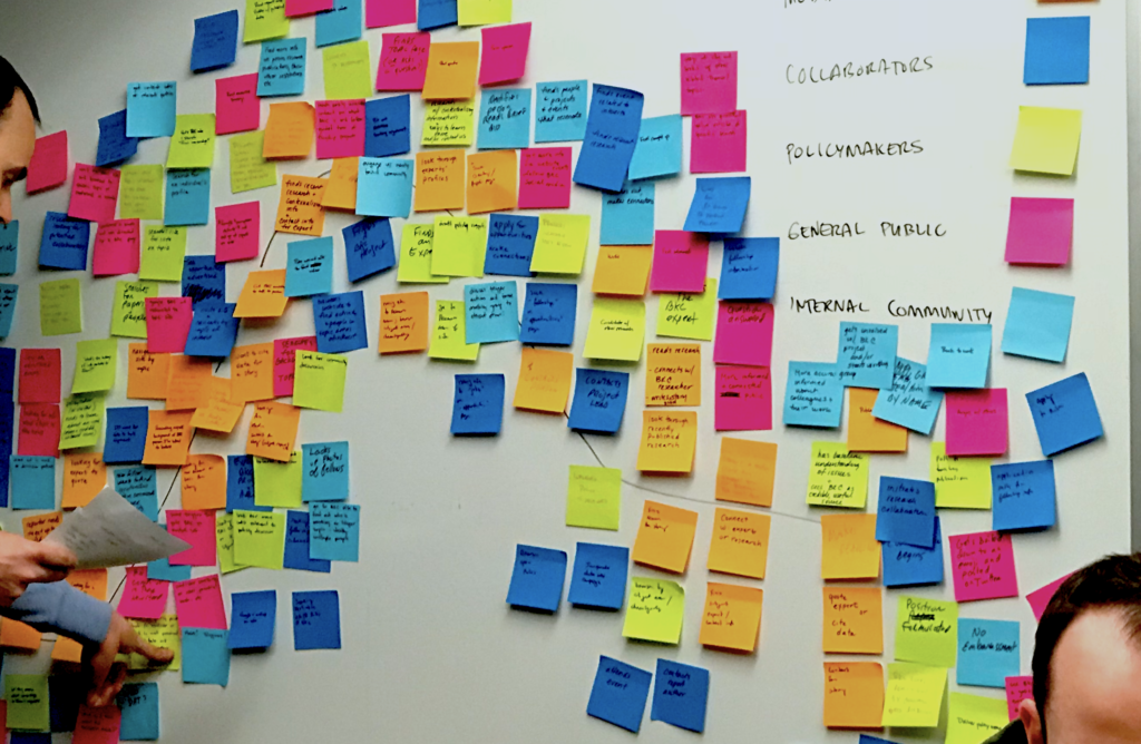
Using competitive analysis, website analytics, surveys of audience and stakeholders, and focus groups we were able to identify three key audiences we wanted to serve: community members; journalists and researchers; and funders. This insight helped us focus our redesign on what could best serve the needs of these audiences.
Our ambitions were to earn and retain the attention of these key audiences in a space that was rapidly expanding and evolving. We wanted to convert visitors into community members, potential funders into established benefactors, and casual researchers into regulars.
Another key insight from our research was that these audiences were simply not using our website. They would connect to our work through social media, often via a post from a researcher or fellow, but then quickly drop off after visiting a single page at our site.
Through a series of design thinking exercises we discovered our major content and design problem statement:
How might we make our work appear more current and relevant?
We generated three personas: 1) an aspiring fellow; 2) a journalist looking to cover breaking news about technology; and 3) a grantmaker whose portfolio covers technology.
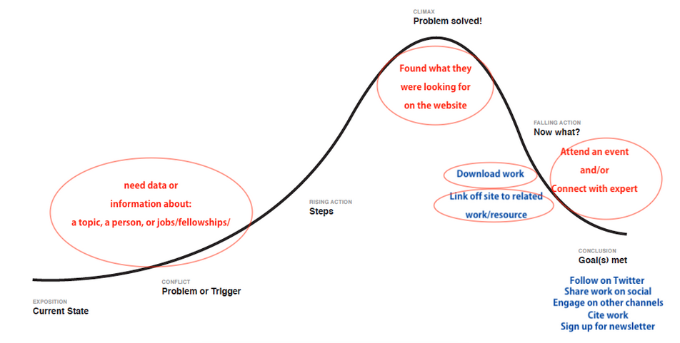
Using a journey map we were able illustrate how a member of one of these key audiences might accomplish their goals on our site.
After getting buy-in and a budget from our executive leadership team we decided on four main goals for the web redesign.
We should:
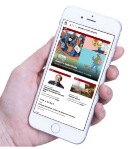
- Modernize the design for accessibility and mobile responsiveness
- Simplify our navigation and user flows
- Establish processes for generating and representing current content
- Find new ways to keep visitors engaged and updated on our work
We also developed some KPIs to assess the impact of our soon-to-be new website:
- Increase CTR and time on site, and use on mobile
- Increase engagements with press
- Accelerate subscription growth across Twitter, email list, and Medium
- Increase mentions of and engagements with our work on social media
Information Architecture
Topics
Our research informed us that even frequent visitors to our site had trouble discerning the signal from the noise. A visitor interested in internet censorship or artificial intelligence would be pointed to our site from a Google search or social media, and quickly get lost navigating a sea of unrelated content.
As a Center with 40+ staff members and 30+ active projects, we were struggling to articulate who we are at a higher level. Visitors wanted to see the broader connections of our work.
So, to simplify navigation we centered our new site’s IA around Topics.
Visitors should be able to explore our work on the topic that most interests them.
For ease of navigation we decided to limit our topic list to no more than eight headings. We performed an open card sort with focus groups to categorize our projects and content under different participant generated headings.
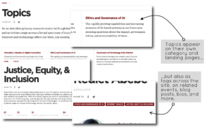
For example, the keywords Justice, Equity, & Inclusion had become a well-understood framing for conversations about the relationship between technology and social inequality — something we learned from competitive analysis and audience surveys — so it became the topic banner for our work in this space.
We built our topic functionality to be flexible on the backend and universal on the front end. Our Topic space would be sure to change, and new vocabulary was sure to evolve over the next several years. So we built in flexibility to easily modify topic names and groupings so we could grow with those changes, with a plan to audit our site annually to adapt. And we wanted topics to be universal across the site so that wherever a visitor was, from the page for a research publication to a staff member’s bio page, they could connect back to the higher level topic.
Events & Community
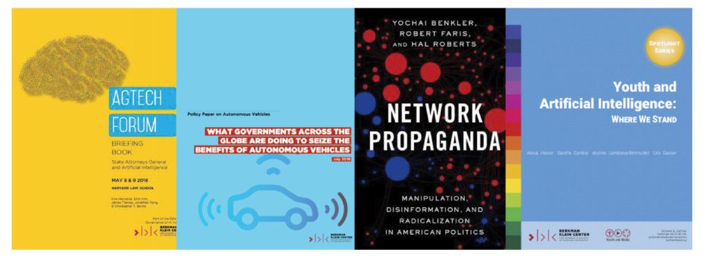
While our Center’s blockbuster research work on topics like artificial intelligence, misinformation, and social media represent some of the biggest efforts from our team, we were losing opportunities to engage with visitors by not frequently updating or elevating relevant content.
We should elevate the content with the most current relevance to our audience
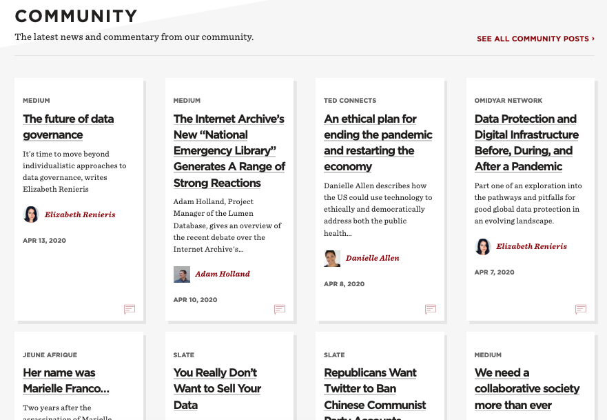
This insight guided me to create a whole new section for content from our community, and establish a simple, semi-automated process to update this space several times a week with stories from our fellows that touched on the most current and newsworthy topics.
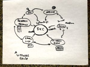
The accelerated generation of content flowed directly into a part of the communications strategy I and my team developed: a virtuous circle of engagement. We wanted visitors to become more engaged community members at any point of contact, whether finding us through a search engine, visiting our website, following us on social media, or subscribing to our email list. Leveraging the new site, we were soon able to streamline the work of generating and repurposing content for any of these platforms.
Prototyping
Insights we got from research and content decisions we made in the IA stage rolled into a few different design challenges as we developed out the features on our site. I scoped these features along with other designers from our team.
Challenge: Homepage
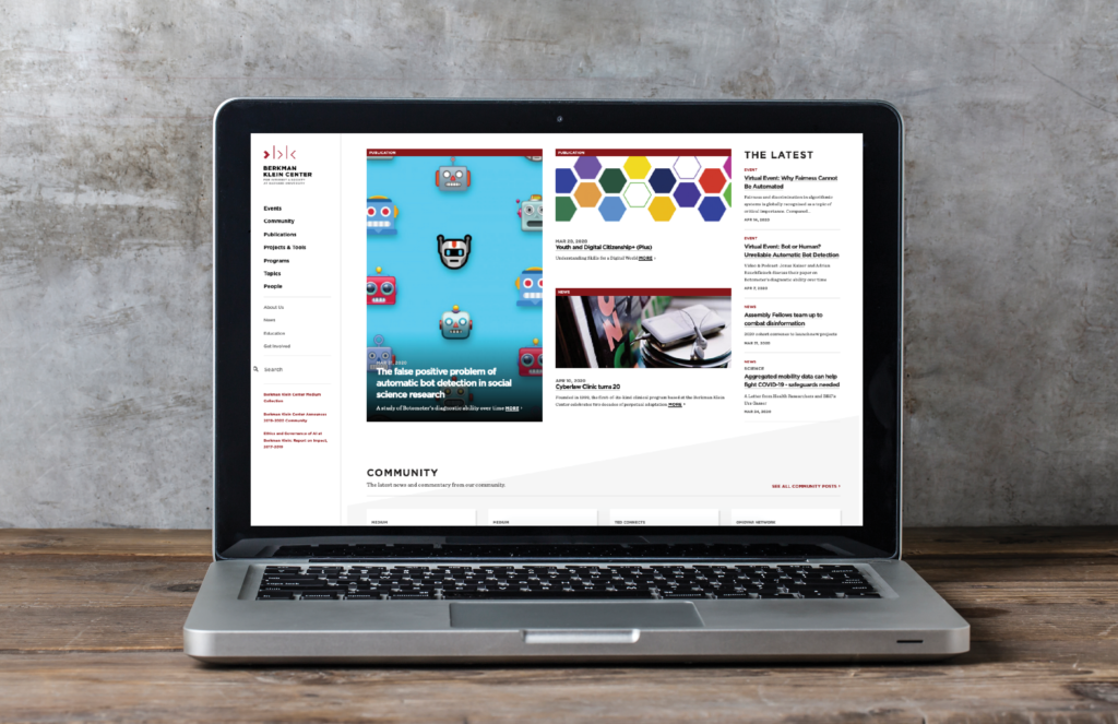
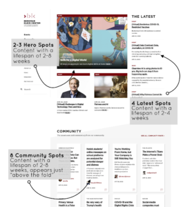
We had several categories of content that we wanted to keep present on the homepage, and be visible on first look. But we didn’t want it just to be a sea of unsorted content.
Solution
We styled out three distinct categories of content preview, and arranged them to ensure they had some presence above the fold.
Challenge: CTA
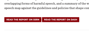
Calls to action needed to pop and not get lost as text links in the body of a page.
Solution
We styled a simple button based on our color palette and font library, and integrated the button feature into our CMS for maximum ease of use.
Challenge: Click-through
We needed to create more opportunities for click-through so users could stay engaged on our site.
Solution
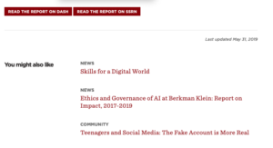
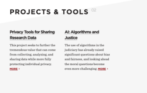
We styled a handful of “related content” features to automatically or manually surface content relationships across the site. A You might also like would autogenerate three related links, while fields like Projects & Tools connected visitors back to top level categories of content and reinforced the greater understanding of the organization.
Challenge: Events
On event days, our office repeatedly got calls from users asking if they could participate in events remotely, even though descriptive text explained how to do so. Event information was getting lost on event pages in blocks of text. The organization was losing out on potential participants.
Solution
We styled and tested special call out fields and some CTA copy for our events pages. As a result, more users RSVP’d to events, and more users understood that they could participate remotely.
Challenge: Community
To avoid the appearance of endorsing viewpoints, the Center wanted to make it clear that news items from fellows and affiliates were not outputs from the Center itself.
Solution
To avoid having to create a whole new content type in Drupal we took advantage of existing fields in the standard article content type. First, we used a checkbox for community content that surfaced a conversation icon on the frontend that was unique to this category of content. Second, we used a flexible eyebrow field for the news outlet, which further signaled to the user that this content was an outside contribution.
We also built a custom RSS ingestion module for Drupal which automated the curation process for pulling this content into the CMS. This automation module has ended up saving 2-3 hours of the Center communications team’s time every week.
Implementation
As we got closer to the final deliverable in Summer of 2018, I became more engaged in detail level tasks of project implementation.
Using GitHub I scoped feature requests and wrote technical tickets for our dev team. I also performed a heavy amount of UX writing, generating breadcrumbs, headers, topic descriptions, and user documentation for other team members who would be managers in our Drupal CMS. Using Adobe Illustrator and Sketch, I mocked wireframes for key features, and generated UI elements such as icons that our dev team folded into the site’s final design.
As I took over the Communications Manager position in Fall of 2018 I led the rollout of our new website.

Impact
A result of the site relaunch in Fall of 2018 was a spike in engagement. Because we were more frequently updating our site with more engaging and newsworthy content, visitors and time-spent-on-site boomed. With more frequent content to direct people to, social channels exploded. Within a year, Twitter followers went up by almost 20,000, and weekly email newsletter subscribers doubled.
But we realized our most important impact by speaking directly with community members. As a result of our simple efforts to better highlight their work, our 2018-2019 class of fellows experienced more publicity for their work and more invitations to collaborate, which helped them in building their careers. Journalists and researchers reached out to us through our press channels with greater frequency. And our funders felt more familiar and engaged with the work our Center was doing.
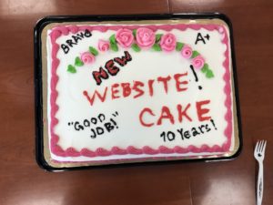
Our new website and communications strategy reinvigorated our image as a world class research institution, and more importantly, helped enhance the impact of our work in the world.
Learnings
Taking on such a big project — migrating an 18,000+ page site housing 20+ years of legacy content, with a limited budget and time, 10+ team distributed members, and 40+ very passionate stakeholders — was a rewarding career experience. You don’t come away from a project like this without some big lessons.
Your internal team is a key audience – don’t forget them!
In our research phase we spent a lot of time identifying external audiences we wanted to better serve. We didn’t spend as much time thinking of our internal team – the staff of the Center who would be actually managing and updating our new site!
We spent some early cycles iterating on features that would have indeed been exciting — like prominent hero images on every page. But after rolling some of these features into production we realized that our communications team would be too over extended to actually maintain content for these features.
We needed features that would save us time, not create new and complicated workflows. Had we done more shadowing, focus grouping, and journey mapping with our communications team earlier on we could have realized this insight and better incorporated it into our thinking.
Prototype, test, prototype, test, prototype…
The vendors we worked with had an uncommon approach of iterating design decisions in production mode. It was pretty cool to rapidly build and share new design directions as they would look in the browser.
But while this helped us a lot in our meetings with stakeholders, who enjoyed seeing iterations in the browser rather than looking at static mockups, it also shortchanged us on some of the critical sketching, wireframing, and user testing stages that would help us build a more robust logic for the site.
As a result, we ended up cementing a lot of design decisionmaking before we could comprehend the full flow that would result from those decisions.
With the benefit of hindsight, I would have spent a lot more time on the prototyping stage to build out our red routes and MVPs before burning a lot of time in production on features we were uncertain about.
Overcommunicate! And also Simplify
Our production team was distributed around the globe, which meant using lots of tools — Slack, Github, Zoom, Google Docs, Trello — to stay on track. When it felt like we weren’t understanding each other, however, a simple one-on-one phone call went a long way to iron out details like feature requests, timelines, or broader objectives. To help our more time-strapped stakeholders, we simplified critical updates into visuals, memos with bullet points, and bolded key decisions to be made. Project management methods like these saved us a lot of headaches and hurt feelings.

