Coach Connect
May 2020
A personalized workout tracking app for runners and coaches to stay invested in their training.
Tools: Sketch, Illustrator, Marvel, InDesign, InVision
Role: UX/UI Researcher and Designer
The Problem
Every year 18 million Americans sign up to run a race. But let’s face it: training for a race, several hours each week, for 12-24 weeks, is a major test, not just of fitness, but of motivation and commitment.
The multi-billion dollar fitness app marketplace has delivered hundreds of tools and features to make the experience of running more fun, more social, or more informed by data. These products work, up to a point. But we still lose countless potential lifelong runners to injury, disappointment, or sheer loss of interest.
Because runners come from many different experience levels, the biggest obstacle to getting them to the finish line in one piece is in giving them a training experience that molds to their needs, understands their motivations, and can respond nimbly to the unique challenges they face.
Skip all the fun research and iteration, and go right to the interactive prototype!
The Solution
Coach Connect is a companion app for smartwatches and training tools to help runners successfully achieve their running goals by building a smart coach into the users’ training plan.
This training-plan focused tool revolutionizes how runners view their past, current, and future workouts, helps them keep track of their experiences, and gives them actionable insights into their progress.
My Process
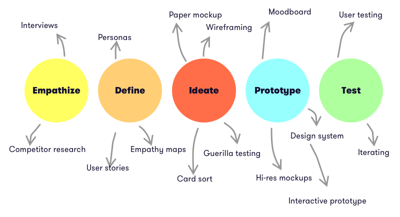
Research & Ideation
I began by exploring academic and popular literature on motivation. I looked at research on fitness coaching, but also other areas, like developing healthy eating habits, quitting smoking or alcohol, or learning a new skill. From this short survey I catalogued some of the existing techniques to increase commitment to positive behaviors, from verbal cues, social reinforcement, and gamification techniques.
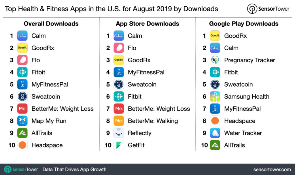
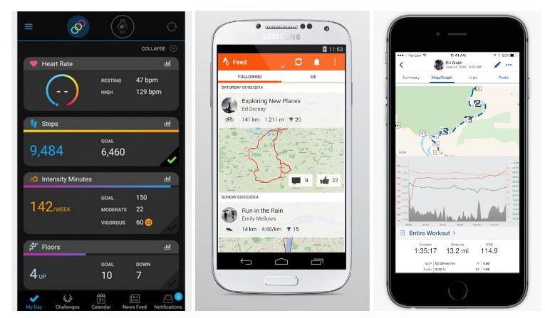
I also downloaded and tested some of the top health and fitness tools to explore their user flows, features, and design systems.
Reaching out to both seasoned and beginning runners from across gender, geographic, and age demographics, I conducted interviews and a diary study to explore what factors help keep them committed to a training plan, and what causes them to drop out. It was important to explore factors within the app environment, but also what they were doing outside of apps to stay on top of running.
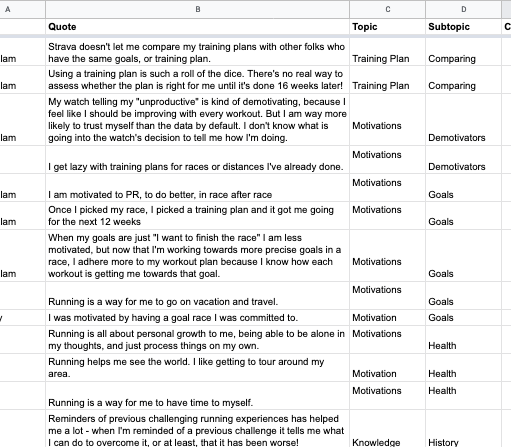
Drawing from my notes I created an affinity map to identify some overlaps, and already some common themes and experiences began to emerge.
To further understand pain points, goals, feelings, thoughts, and behaviors, I generated empathy maps for our two categories of runner: the experienced runner and the first time runner.
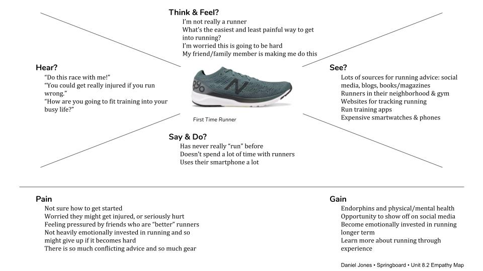
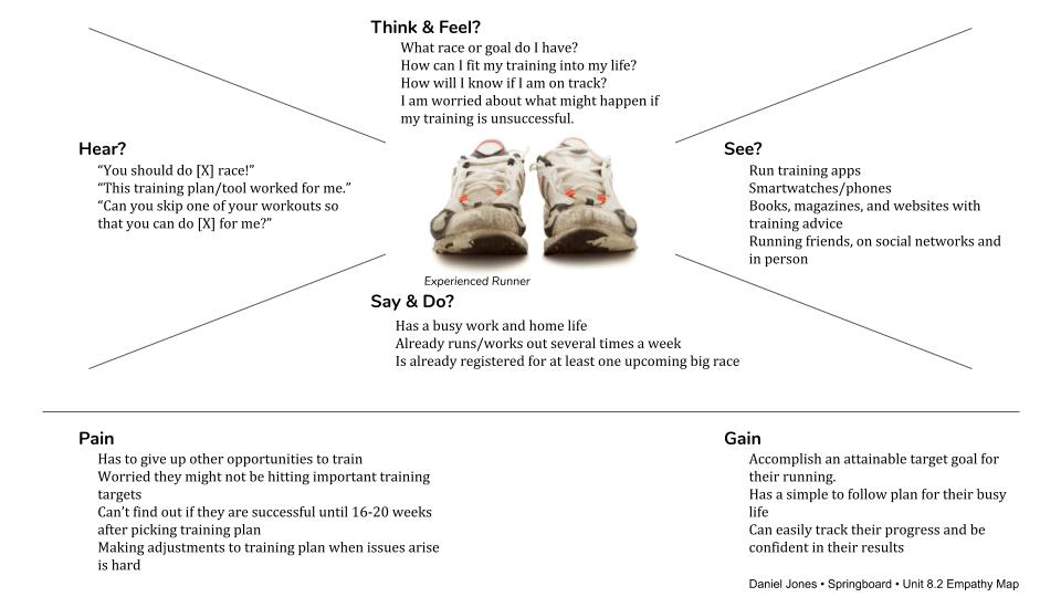
These empathy maps helped me distill some of the takeaways from my research into more simple feelings, thoughts, and actions that runners have.
Insights
I came away with a few key insights that focused the challenge of improving the runner’s training app experience. It wasn’t that we were missing a particular training tool. In fact, there may be too many – dozens of Couch-to-5K plans, gamified running apps, and pricey coaching platforms that were missing the mark for our users.
The training plans themselves aren’t the problem. What runners are missing are the fine tuned features to help them succeed in their training over the long term.
How to get there in an app environment? The three key insights to focus on are simplicity of plan, qualitative reflection, and learning.
“I find myself much more willing to do the workout if the watch or tool tells me what I am supposed to do, and pings me with the info, rather than just knowing I’m supposed to do some workout that’s in my book.”
-User quote
Simplicity of plan
Runners using digital tools struggle to know exactly what workout is coming up. Having effective reminders, simple and adjustable views of what is ahead, and a plan to execute drove greater likelihood of completing most workouts. In contrast, having to use multiple tools to structure a training plan or a cluttered or non-intuitive dashboard made sticking to the plan less enjoyable.
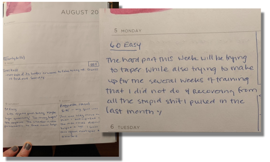
“Journaling and identifying qualitative trends for myself has been really helpful to identify how I’ve felt. When I’m reminded of a previous challenge it tells me what I can do to overcome it, or at least, that it has been worse!”
-User quote
Qualitative reflection
Recording how they felt after a run made a big difference for runners. Two runners I interviewed shared how they use physical journals to create a log they could look back on in order to stay motivated or remind themselves of solutions to challenges. One user added “The very act of writing about my training and thinking about it through journaling keeps me invested in my running and my goals.”
“Using a training plan is such a roll of the dice. There’s no real way to assess whether the plan is right for me until it’s done 16 weeks later!”
-User quote
Social reinforcement & knowledge base
Runners who had a coach or friend to guide and cheer them on were more accountable to their goals. But in these interactions they also found a resource for knowledge and ideas, including how to actually train and overcome issues. One participant said that when they started out in running they didn’t realize why they got painful rashes after running long distances in the heat. It wasn’t until they spoke to other runners that they found out it was a common problem, and there were products and strategies they could use to prevent it.
Personas
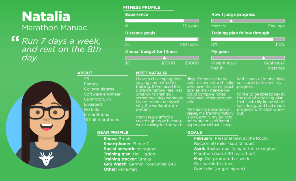
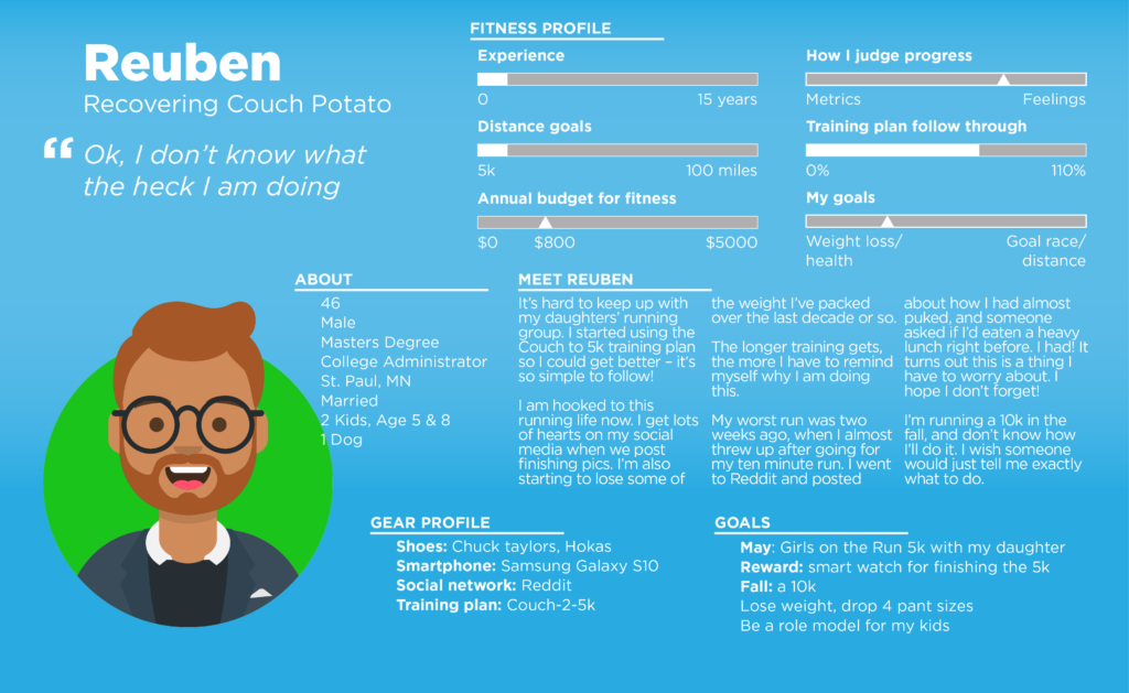
Research and insights informed a pair of personas to represent two users going forward: the marathon maniac – an experienced runner – and the recovering couch potato – new to the sport. These personas, including their mental models, their orientation to running, and tools they use, keep the development of this tool focused on its core user base.
Pulling all of this together I established four problem statements:
- How might we help runners interact with their training plans as simply and quickly as possible?
- How might we help runners gain better insights and judge their own progress based on the record of their own training and that of others?
- How might we provide more and better opportunities for runners to reflect on their workouts?
- How might we better connect runners to the knowledge and experience of the thousands of other runners who are using the same product or training plan, or have the same goals and challenges?
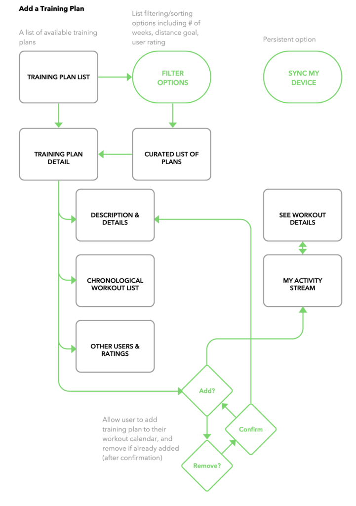
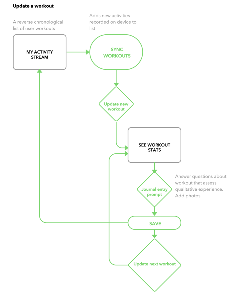
MVPs, Sitemap, and Wireframes
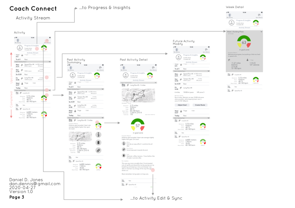
I focused my tool on the three key screen experiences that would be most useful to our runners:
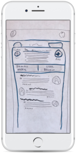
Activity Screen – How they can track their training tasks day to day and week to week
Finished Workout – How they can reflect on their workouts
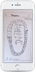
Progress & Insights – How they can assess progress over time, track trends, and improve
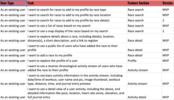
Having a sitemap was critical to this tool as I wanted to sidestep some of the navigation challenges of other feature dense fitness tools that can drive new users away.
I sketched these out into some paper mockups that I then guerilla tested with some users at coffee shops and on a running path using Marvel.
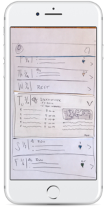
In Sketch I further refined these three features into some basic wireframes, and tested interactivity using InVision.
Design Guidelines
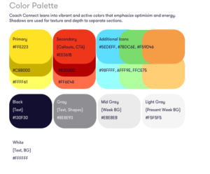
For my styleguide I drew inspiration from Material Design’s guidance for intuitive and beautiful components, and referred back to my research to discover the specific design elements that would best suit users.
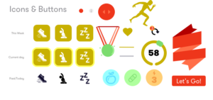
Runners need the layout to fit their context. Colors that energize, screens that are simple and high contrast so that it can be easily navigated in bright, outdoor environments, and iconography that makes the tool both useful and fun to use.
I spun up a couple heuristics for UX design and copy as well. All functional elements need to be:
- actionable — users want to know clearly and exactly what to do
- motivational — users want messaging that will encourage them, not discourage them; negative/passive language or visuals should be avoided
Interactive Mockups
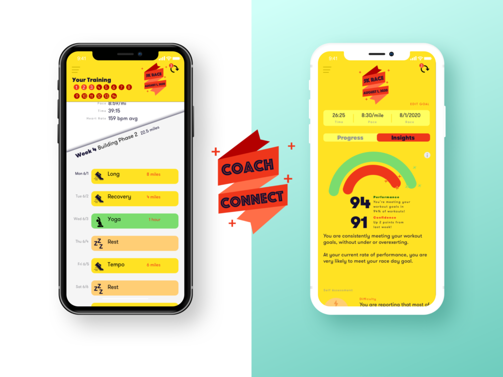
I created a high fidelity prototype that I could test with real users with InVision (explore the interactive version below or on InVision). As the features of this tool began to take shape on desktop, I double checked their fidelity on mobile, and modified my style guide (frequently!)
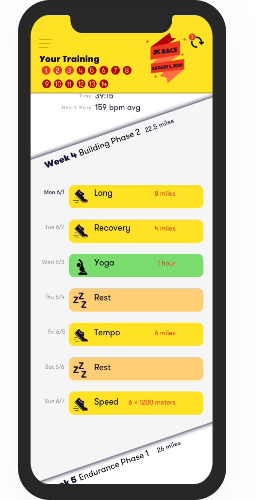
See your next workouts
The default activity screen starts with the most actionable information: your upcoming workouts. A preview of every workout scheduled in the next seven days. Each day shows you the type of workout and the amount of work you have to do. Want to make sure you’ll be able to squeeze in your run between lunch and an afternoon conference call? This view will tell you exactly what you need to do, no more, no less.
Learn from past workouts
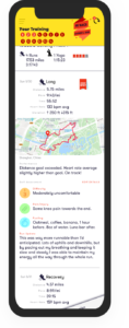
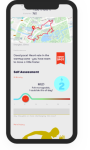
All of your workouts — future, current, and past — are in the same chronological view. Scroll down to see last week’s workouts, and click for all the details you expect, from a map, to heart rate, distance, and pace. And some additional details that you might not expect. A performance report that tells you how well you met the workout goals, and what you can do next time. Any pains or injuries you want to note. What you ate to fuel the run. How you felt after.
Record and reflect, so you won’t forget
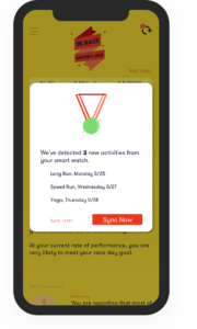
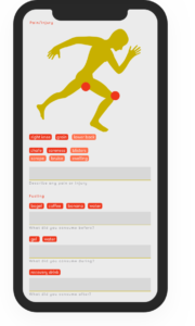
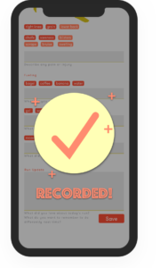
Coach Connect goes beyond the charts and graphs. When you perform a workout and record it to the app you get a chance to record some of those details that other workout apps forget to ask you about. Instead of just having a blank field to record your thoughts, you get prompted to record the things you wish you’d kept track of. Fluid interactions and autofills for effort level, injuries and pain, and fueling.
See your overall progress at a glance
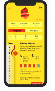
An easy-to-find reminder of your overall goal, and way to see where you are in your training plan. Want to know how many miles you’ve gone total? How many workouts you have left? How intense the coming week is going to be? Find it all here.
Gain insights that help you reach your running goal
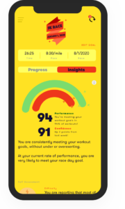
All of those views with numbers and trends are fine, but you want to know how you can improve. Are you performing better after drinking coffee? Are you pushing a little too hard on your long runs? By analyzing your performance and your self assessments Coach Connect tells you what to make of the trends. A Confidence rating tells you how likely you are to reach your goal. If you need to back off, you can always pause your training or change your plan.
Project Learnings
Research and user testing is the beating heart of UX.
So much of what I learned doing this project came from talking to many kinds of runners. Beginning runners, experienced runners, older runners, younger runners, women, men. If I hadn’t opened up my interviews across broad demographics I never would have gained the key insights about run journaling that formed the core feature of this tool. Testing this core feature at many different stages with runners helped me check my hypothess and refine my work.
Focus MVPs, but save some cool ideas for later.
I spent a lot of time in ideation spinning out features that I ended up scrapping. A training plan picker. A social network. I thought there was a lot of room for improvement on these features compared to existing tools. But as I developed and tested paper mockups and wireframes I realized where the most valuable deliverables were. I took note of the cool feature challenges I might want to take on for a later iteration, and that let me focus my energy on what users were telling me was really revolutionary.
Let the UI sleep.
The hi fidelity mockup stage is one of my favorite sandboxes to play in. But the perfectionist in me wants to refine and revise typefaces and icons until the sun comes up. I must have spent hours on a performance meter icon that I ended up scrapping completely after user testing revealed that it wasn’t meeting my Actionable heuristic. Some of the greatest design breakthroughs I had came, not from spending hours behind the computer or checking my moodboard yet again for inspiration, but from leaving Sketch alone for the day and going for a run or reading a book to let the design percolate.
It was critical to get some of the fundamentals for the UI organized. One step I learned to take before even touching the design system was to do a written audit of all my features, text components, and icons in a spreadsheet. I narrowed down and eliminated a lot of unnecessary elements that I would have ended up wasting time on when designing.
Conclusion
This project really pushed me to work on some of my greatest challenges as a designer. As a perfectionist I had to learn to let the little flaws stop bothering me and let myself sketch. As a researcher I had to learn to not let my own hypotheses and biases get in the way of delivering something my users didn’t actually want.
I got started on this project as a potential client: I am a runner and a frequent user of health and fitness tools, but I always feel like I am doing something wrong with my training. It has been really validating to speak to lots of athletes and coaches throughout this project and realize there is still a lot of space for these tools to improve and better serve their users.
This was reinforced when one of my testers who is a coach remarked at the end of our conversation, “I would use this as a coach for my athletes! It’s much faster and intuitive than what’s already out there.” I plan on continuing to make refinements on this tool, including animating some gestures and creating a video walk-thru to bring it to life.

