LivelyHood Org Dashboard
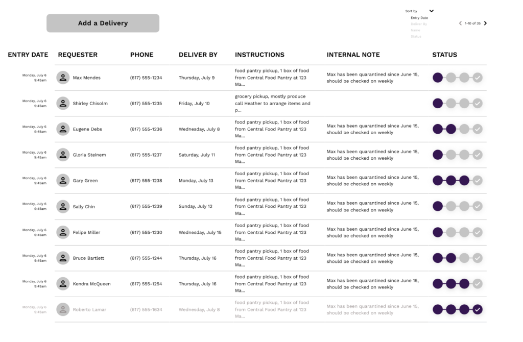
Livelyhood.io, 2020
Figma
Role: UX/UI Designer
In late June 2020, the founders of LivelyHood.io connected with me to develop a new set of features to scale up their community service platform.
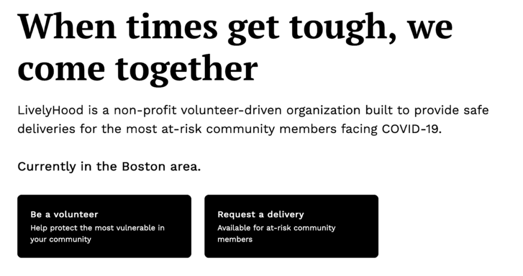
The founders are Harvard Business School students who started LivelyHood to assist vulnerable community members affected by the emerging COVID-19 pandemic. The goal was to connect volunteers who could help deliver groceries and food pantry boxes to folks who likely could not leave their homes due to health concerns.
The Problem
At this early stage, LivelyHood succeeded in solving a supply problem: they were finding lots of offers for volunteers to do deliveries. But they were having trouble with the demand side. It was hard to reach vulnerable community members, for several reasons, including lack of access to the technology and lack of awareness of the tool.
The Solution
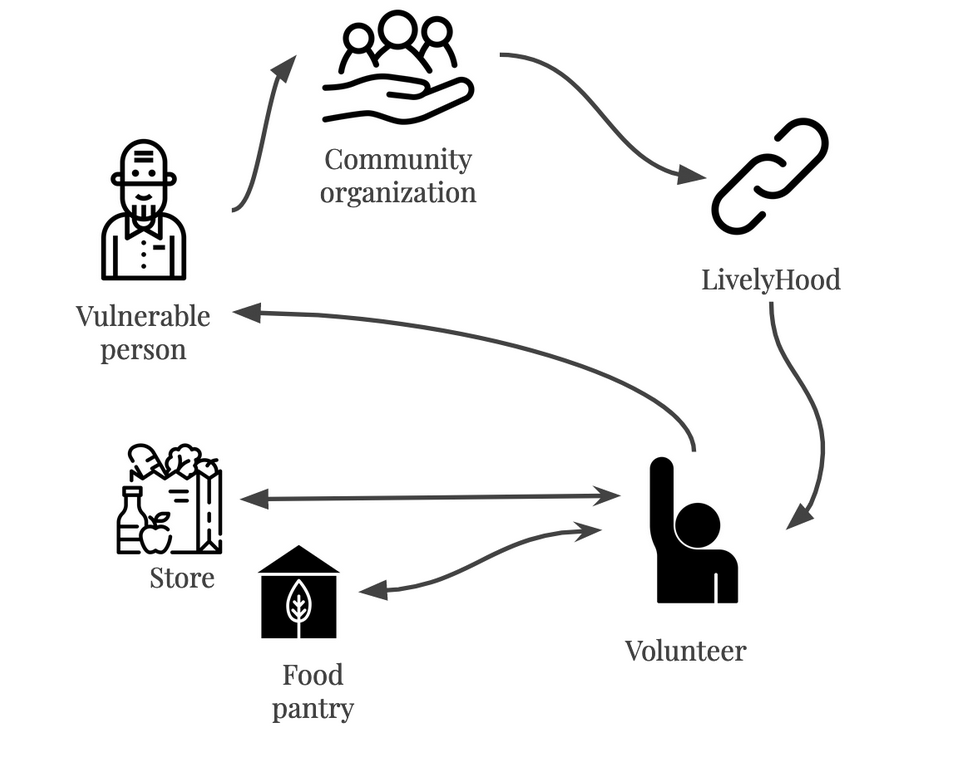
Luckily, the founders had already begun noodling on a business solution to this problem: an organizational partner model to help connect to larger groups of vulnerable folks who could benefit from LivelyHood’s services.
How might we help community organizations reach their vulnerable community clients with delivery needs?
In this model, LivelyHood works with community organizations who already have relationships with needy clients in the community, and connections with food pantries. Instead of trying to find clients through advertising or word-of-mouth, LivelyHood’s role would be to solve a last mile problem for organizational partners, connecting the dots between a food provider and the needy client.
Project Plan
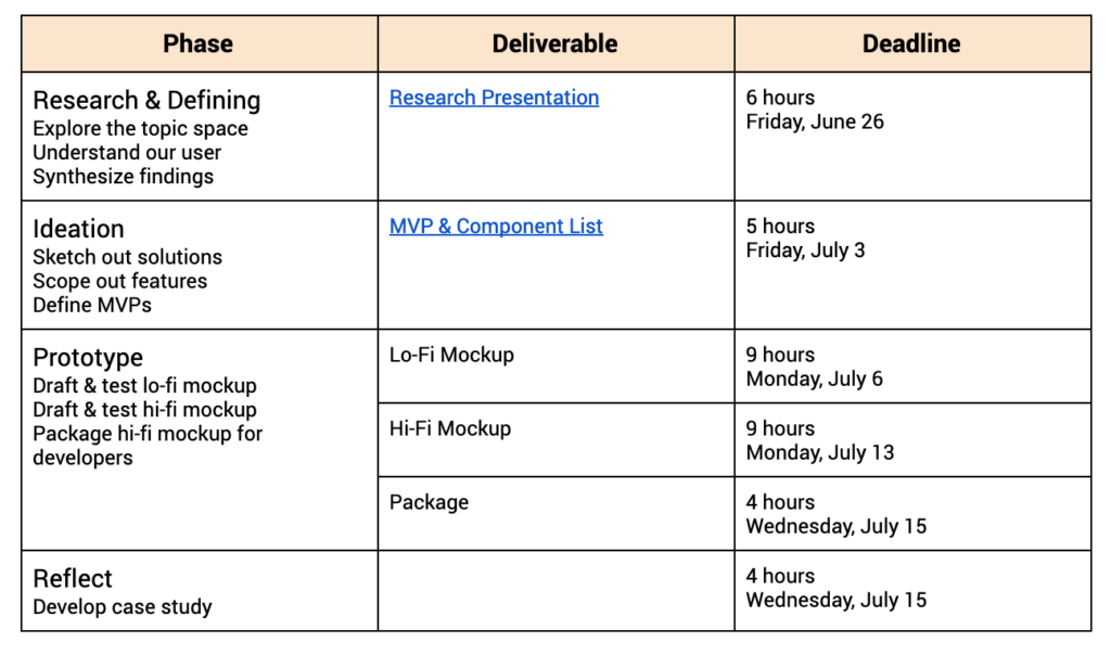
The need was urgent, so I wanted to move fast, and deliver a final result in about 4 weeks, while working in my free time. I mapped out a project plan to get us to MVP as quickly as possible.
Research & Defining
I began by exploring the problem space with some competitive research. A few organizations already exist that perform a similar function to LivelyHood — connecting volunteers to vulnerable community members — but there were also some models from adjacent markets that could inform our work — delivery platforms, local social networks, and volunteer campaign facilitators.
I tested these tools and performed a quick feature audit and matrix.
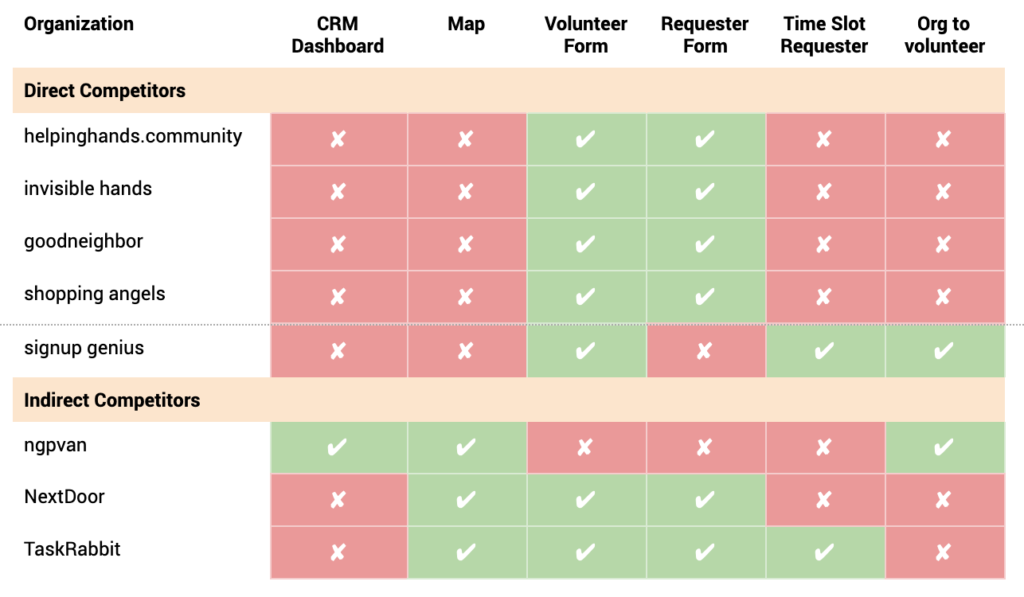
This exercise helped me to learn some useful insights:
Our model is unique
Though some services with a P2P model exist for volunteer delivery matchmaking, none of the direct competitors I explored had a one-to-many model. We were working in unique territory, solving a problem for organizations, not just vulnerable individuals.
CRM is the model
Looking at one indirect competitor, I discovered the Customer Relationship Management (CRM) model, which uses larger database structures and dashboards to facilitate actions and track information. This would be a useful model to draw from as we developed our tool.
Our User
Our user is a client representative from a community non-profit, so I was eager to do a set of user interviews with this group to learn about their constraints and pain points. Unfortunately, we learned that our key users were inaccessible, as they dealt with heavy caseloads of community members, and could not make the time for conversation. Luckily, LivelyHood’s founders had extensive communication with one potential partner already and were able to share useful insights about their context.
From a short conversation I was able to develop a persona.
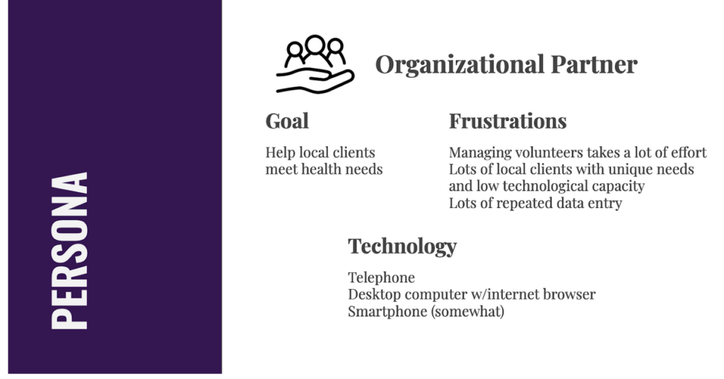
Having learned all of this, I now knew a few things about the platform I would be designing:
The platform is delivery-focused
User is the key point of contact to the clients already, as well as food pantries. They need LivelyHood to be their delivery intermediary.
The platform is efficient and scalable
User needs to efficiently facilitate dozens to hundreds of requests on behalf of their clients.
The platform is optimized for desktop
Though the current platform is optimized for mobile, our user is usually behind a desk making lots of phone calls, so we need this to be based in a desktop website format.
Flip through my research slides!
Ideation
Ideas for features were already starting to take shape. I led a brainstorming session with two partners from LivelyHood to produce a user task flow that would take our user from their first client contact, to submitting a completed client request.
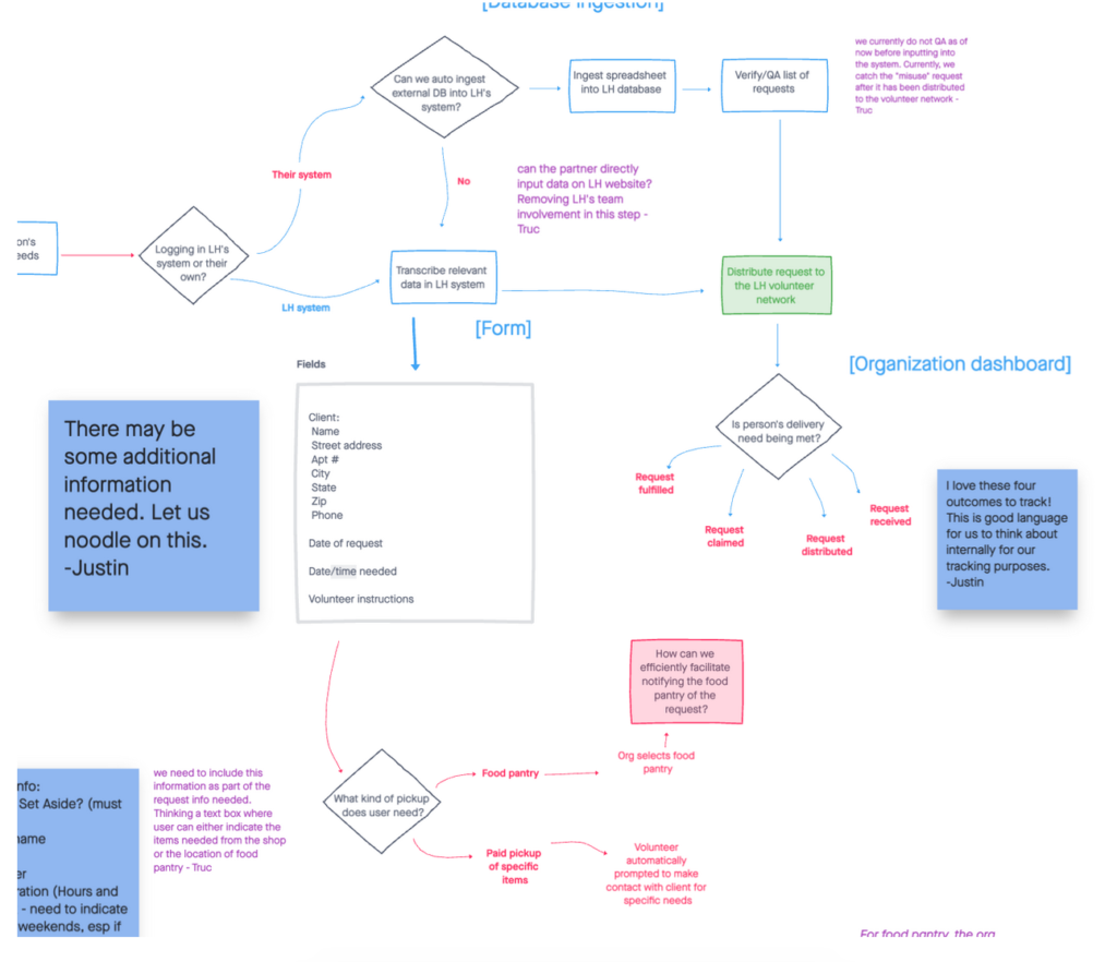
I love this exercise because it’s very hands on and visual, and gets you to think through lots of hypotheticals and edge cases with your team. And when you’re done you’ve basically got a sense of your product’s key features and flows.
I made a spreadsheet of these features in the form of MVPs and user stories.
Prototyping
There’s an old story about a group of blindfolded men attempting to describe an elephant. Each of them is touching a different region of the elephant, so they each have a different idea of what the whole elephant looks like.
Prototyping after ideating with a team can be a lot like trying to describe the elephant: everyone on your team has a different mental picture of what the product looks like, but no one knows how it all comes together.
I have an incentive here in the first part of the prototyping stage to work quickly and lightly so I can get a visual representation of our idea for discussion and testing. And then save the refining and designing for later.
Based on my user stories, going into prototyping I knew I would be illustrating these primary features:
- A sign-in/log-in/onboarding flow
- An input flow for adding new clients to the system that permits
- one-by-one entries
- batch upload
- A dashboard feature that shows
- active client requests
- past clients
- visual metrics
I began by doing some research into inspirations and developing some quick ideas of what we want our user to see for the above screens. Guidelines for better tables and form elements got me thinking about how best to simplify our user’s experience.
Prototyping would take place in three phases:
1. Lo-Fi Sketches
Simple illustrations of key features to demonstrate functionality and information design.
Test with stakeholders to see if we are on the right track.
Begin to assess engineering contingencies.
Re-sort feature elements into MVPs vs. later iterations.
2. Mid-Fi Mockups
Incorporating feedback from sketch review.
Building and applying a rough design system.
Working with engineering to estimate time commitments for implementation.
Testing with stakeholders, and external testers.
3. Hi-Fi Prototype
Incorporating feedback from Mockup review.
Organizing components and cleaning up Figma file.
Applying interactions to make a living prototype.
Final test with stakeholders.
Lo-Fi Sketches
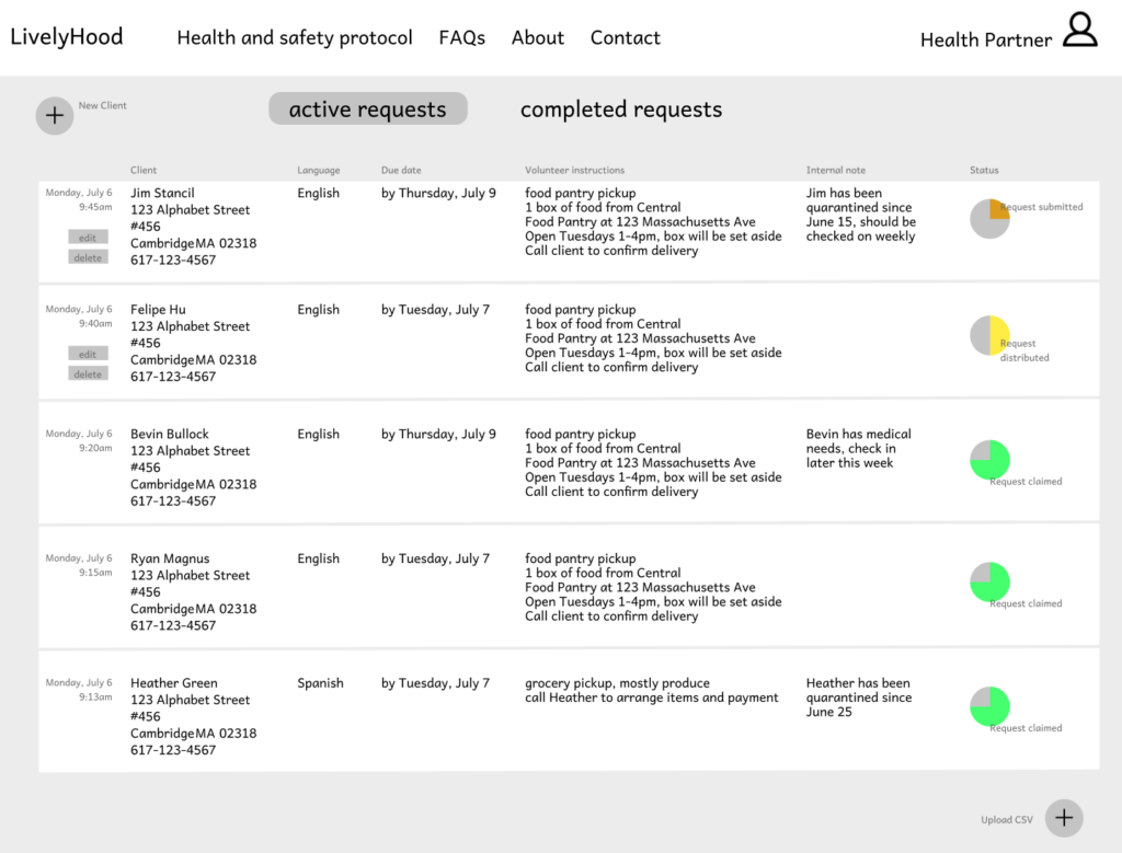

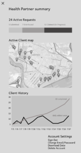
Flip through the lo-fi explainer slides!
Working in low fidelity let me focus entirely on flow and function, which helped in my review session with the founders, as we could bookmark questions of design, and just think about how the tool works.
During our discussion we took notes as to the functions & flows we thought the user would like, and ones we would start to rethink, using a + / delta chart. 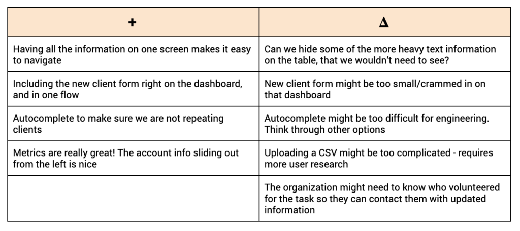
I fed this information back into user stories to scope features more deeply, and prioritize/de-prioritize features in the next phase.
Mid and High-Fidelity Mockups
I incorporated this feedback as I developed the next two iterations. In this phase I also began to apply a design system and demonstrate interactions. I adapted some Material Design components to have consistent spacing across the table, and give some depth to interactive or layered components.
And with most of the hard decisions discovered through the ideation and lo-fi testing stages, I had more time to focus on some of the intricate details that could make the interface more usable.
With a lot of information that a user would need at their fingertips, I wanted to economize by lowering the density of information, and building in lightweight interactions to reveal details and key functions.

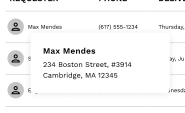
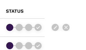
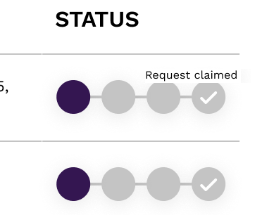
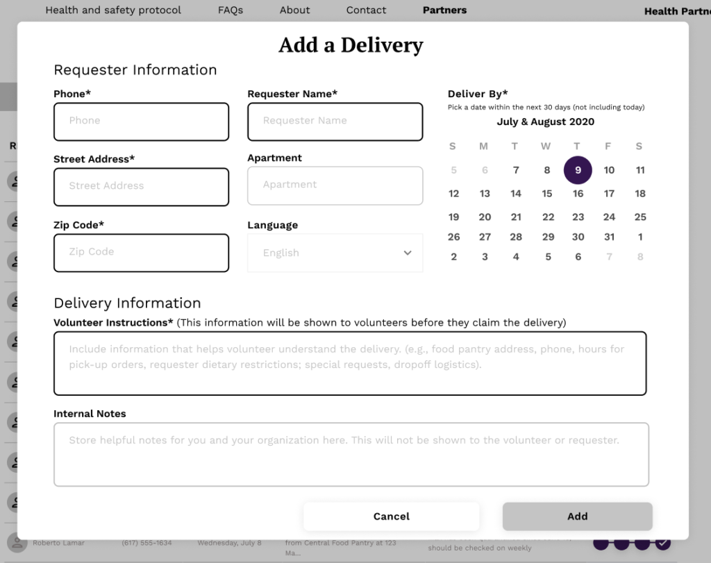
Being able to do all this rapid prototyping in Figma alongside our developer and project manager allowed me to test ideas, talk out edge cases, and scale back when we discovered the dev costs would outweigh the immediate user benefits.
Explore the high-fidelity mockup on Figma!
Learnings
Rely on existing models outside of your market
Early on in research I realized that competitors were not providing a useful analogue for the tool we were going for. Our scale was bigger than peer-to-peer, and the screen-by-screen flow wouldn’t work for our user. Customer Relationship Managment (CRM) tools provided the appropriate frame for our needs: a dashboard to manage and monitor a larger scale of inputs.
User surrogates are better than nothing
I originally thought that not being able to communicate directly to my user would prove disastrous for developing the product. How would I gather insights and test my prototypes? But I relied on my partners’ extensive groundwork in this space to test my ideas, and they provided critical guidance that got us to a solution that met basic needs. Sometimes you just need to get the basics of the product created and then iterate after its in the users’ hands!
Figma is great!
My first project with Figma! Initially it was overwhelming, but gradually it became more and more intuitive. The component features are amazing, as are the prototyping functions. And we could make and test changes on the fly, right in review meetings, saving a lot of time. I found myself working a lot faster than in other tools.
Conclusion
LivelyHood is a timely product. As COVID-19 proved to be an enduring presence in our lives, the need for robust tools that help people quarantine while making sure their needs are met became obvious.
It was a treat to get to work on a project that had immediate, real-world relevance.
But I also got to make the tool simple, intuitive, and even a little bit fun to use.
Want to see more? Check out another one of my projects!
